R Project
This cookbook may generate graphs and calculate statistics using the free R project: http://www.r-project.org/.
This cookbook originally predominantly used the R project along with the xts and zoo libraries, but there have been some major regressions in the xts library and at the time of this writing, it was in the process of a major overhaul. After some research, the general approach has switched from R to gnuplot. R is still great for its statistical capabilities, and gnuplot has a lot of warts, particularly around margins with multiplot, de-duplicating X-axes, etc., but gnuplot is a solid tool that's been around for a while and the core of it is suited for the cookbook's simple needs. Perl scripts continue to do the heavy lifting of converting raw data into a CSV so it's often just a matter of passing the CSVs to gnuplot instead of R.
R is designed to work on Unix, Windows, and Mac. R is normally distributed with operating system package managers (e.g. "yum install R" with epel.repo enabled=1 in RHEL), or you can download binary or source packages from https://cran.rstudio.com/.
To run R from the command line, simply type R and you'll be in a read-evaluate-print-loop (REPL). Some basic commands you'll need:
- q() to quit (usually type 'n' to discard the workspace)
- ?CMD to get help on CMD
We'll be using some external packages so the first time you use R, you'll need to install them:
> install.packages(c("xts", "xtsExtra", "zoo", "txtplot"), repos=c("http://cran.us.r-project.org","http://R-Forge.R-project.org"))R has its own package management system and this will download the specified third party packages from the web.
Install Package from Source
> install.packages("http://download.r-forge.r-project.org/src/contrib/xtsExtra_0.0-1.tar.gz", repos=NULL, type="source")Another example:
$ svn checkout --revision 850 svn://svn.r-forge.r-project.org/svnroot/xts/
$ R
> install.packages("xts/pkg/xts", repos=NULL, type="source")
> install.packages("xts/pkg/xtsExtra", repos=NULL, type="source")
Graphing CSV Data
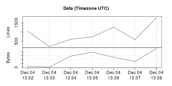
An example script is provided which graphs arbitrary time series data in a comma separated value (CSV) file using plot.xts. The script expects the first column to be a time column in the following format: YYYY-MM-DD HH:MM:SS
For example, with the following CSV file:
Time, Lines, Bytes
2014-12-04 13:32:00, 1043, 12020944
2014-12-04 13:33:00, 212, 2737326
2014-12-04 13:34:00, 604, 139822275
2014-12-04 13:35:00, 734, 190323333
2014-12-04 13:36:00, 1256, 126198301
2014-12-04 13:37:00, 587, 72622048
2014-12-04 13:38:00, 1777, 237571451
Optionally export environment variables to control the output:
$ export INPUT_TITLE="Data"
$ export INPUT_PNGWIDTH=600
$ export INPUT_PNGHEIGHT=300
$ export TZ=UTC
Run the example script with the input file:
$ git clone https://github.com/kgibm/problemdetermination
$ R --silent --no-save -f problemdetermination/scripts/r/graphcsv.r < test.csv
The script generates a PNG file in the same directory:
Package Versions
Display loaded package versions:
> library(xts, warn.conflicts=FALSE)
> library(xtsExtra, warn.conflicts=FALSE)
> sessionInfo()
R version 3.1.2 (2014-10-31)
Platform: x86_64-redhat-linux-gnu (64-bit)
...
attached base packages:
[1] stats     graphics  grDevices utils     datasets  methods   base

other attached packages:
[1] xtsExtra_0.0-1 xts_0.9-7
Test Graphing
Test graphing with the following set of commands:
$ R
library(zoo)
library(xts)
library(xtsExtra)
sessionInfo()
timezone = "UTC"
Sys.setenv(TZ=timezone)
sampleData = "Time (UTC),CPU,Runqueue,Blocked,MemoryFree,PageIns,ContextSwitches,Wait,Steal
2014-10-15 16:12:11,20,0,0,12222172,0,2549,0,0
2014-10-15 16:12:12,27,1,0,12220732,0,3619,0,0
2014-10-15 16:12:13,30,0,0,12220212,0,2316,0,0"
data = as.xts(read.zoo(text=sampleData, format="%Y-%m-%d %H:%M:%S", header=TRUE, sep=",", tz=timezone))
plot.xts(data, main="Title", minor.ticks=FALSE, yax.loc="left", auto.grid=TRUE, nc=2)
Common Use Case
> options(scipen = 999)
> x = read.csv("tcpdump.pcap.csv")
> x = na.omit(x[,"tcp.analysis.ack_rtt"])
> summary(x)
     Min.   1st Qu.    Median      Mean      3rd Qu.      Max.
0.0000020 0.0000050 0.0000070 0.0001185 0.0002290 0.1222000
> sum(x)
[1] 58.69276
> length(x)
[1] 306702
> quantile(x, 0.99)
     99%
0.000388
> plot(density(x[x < quantile(x, 0.99)]))
Example graphing mpmstats data
As an example, this will show how to graph IBM HTTP Server mpmstats data. This is a very simple but powerful httpd extension that periodically prints a line to error_log with a count of the number of threads that are ready, busy, keepalive, etc. Here's an example:
[Wed Jan 08 16:59:26 2014] [notice] mpmstats: rdy 48 bsy 3 rd 0 wr 3 ka 0 log 0 dns 0 cls 0
The default interval is 10 minutes although I recommend customers set it to 30 seconds or less. Typically, look at bsy as this is an indication of the number of requests waiting for responses from WAS.
First, we'll convert this into CSV format using sed:
OUTPUT=error_log.csv; echo Time,rdy,bsy,rd,wr,ka,log,dns,cls > ${OUTPUT}; grep "mpmstats: rdy " error_log | sed -n "s/\[[^ ]\+ \([^ ]\+\) \([0-9]\+\) \([^ ]\+\) \([0-9]\+\)\] \(.*\)/\1:\2:\4:\3 \5/p" | tr ' ' ',' | cut -d "," -f 1,5,7,9,11,13,15,17,19 >> ${OUTPUT};Example:
Time,rdy,bsy,rd,wr,ka,log,dns,cls
Jan:08:2014:16:59:26,48,3,0,3,0,0,0,0
Now, we're ready to pipe error_log.csv into an R script that generates a PNG graph and an ASCII art graph. Here is the script (save as mpmstats.r):
require(xts, warn.conflicts=FALSE)
require(xtsExtra, warn.conflicts=FALSE)
require(zoo, warn.conflicts=FALSE)
require(txtplot, warn.conflicts=FALSE)pngfile = "output.png"
pngwidth = 600
asciiwidth = 120mpmtime = function(x, format) { as.POSIXct(paste(as.Date(substr(as.character(x),1,11), format="%b:%d:%Y"), substr(as.character(x),13,20), sep=" "), format=format, tz="UTC") }
data = as.xts(read.zoo(file="stdin", format = "%Y-%m-%d %H:%M:%S", header=TRUE, sep=",", FUN = mpmtime))
x = sapply(index(data), function(time) {as.numeric(strftime(time, format = "%H%M"))})
txtplot(x, data[,2], width=asciiwidth, xlab="Time", ylab="mpmstats bsy")
png(pngfile, width=pngwidth)
plot.xts(data, main="mpmstats", minor.ticks=FALSE, yax.loc="left", auto.grid=TRUE, ylim="fixed", nc=2)
And we run like so:
$ cat error_log.csv | R --silent --no-save -f mpmstats.r 2>/dev/nullThis produces the following ASCII art graph. The x-axis requires integers so we convert the time into HHMM (hours and minutes of the day on a 24 hour clock).
If you only wanted bsy in the graph, just take a subset of data in the plot.xts line:
plot.xts(data[,2:2], main...